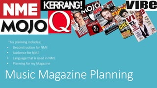
1. This planning includes:
• Deconstruction for NME
• Audience for NME
• Language that is used in NME
• Planning for my Magazine
Music Magazine Planning
2. Image of the magazine in question
I chose this magazine because it features a wide range of music from ska and
reggae to heavy metal and punk. This music is easily recognisable on the
shelves in shops and has been around for a very long time in the music
magazine industry.
My music magazine is going to be based on this music magazine and feature
bands broadly similar to those featured in this magazine. Features that I may
include in my music magazine from this music magazine are:
• The use of backgrounds for text
• A large picture of an artist or band
• Speech bubbles as if the model in the picture is thinking about something
or saying something.
• A large clear masthead
• A large clear banner containing the main storyline.
4. Denotation of Images
The main picture of Noel Gallagher is bright, bold and very in the reader’s face. It
shows him to look pensive and thoughtful with speech bubbles supporting this idea.
In addition, the speech bubbles around the left hand side of Gallagher give answers
to the questions saying that he has confidence in his band and that the public will like
his music away from Oasis with his new band.
A very small image of John Peel in black and white scaling supports the main double
page spread inside. This image is in the top right hand corner of the front cover and
does catch someone’s eye because of the text on the coloured backgrounds
surrounding it too.
The images are very good and say very prominent message that can conveyed in
many different ways. For example, the speech bubble that says, ‘Is the new album
great?’ could be conveyed in a conservative way – he is unsure whether the new
album isn’t as good as he originally wanted it to be – or it could be conveyed in a
positive way – he is positive that all his fans will enjoy the new album and that it will
have no problems in selling in vast amounts and will gain in popularity.
5. Masthead
The masthead fits in with all other text on the cover in that the idea of brightly
coloured background with simple white text on them can be easily read from a
distance and the people can easily identify it on a shelf in a shop.
The masthead is also very short and snappy with it only being 3 letters long and
therefore people aren’t wasting time in reading the masthead of the magazine for a
long time and get an incline in what the magazine is about even before reading the
cover and the contents of the magazine because NME is very popular and
recognisable in the music magazine industry.
The masthead fits perfectly in the top left hand corner of the page, and the
publishers have really thought about the two-thirds rule. This is the rule that
publishers and designers use because the naked human eye is naturally drawn to
anything that is drawn to the top two-thirds of the page. Therefore, by placing the
masthead in this area, the person buying the product can immediately know what the
magazine is and what the main strapline of the magazine is also.
6. Layout
The layout of the front cover in very ordered and simplistically created. This makes
the cover look colourful, eye-catching and thoughtful because of the image of Noel
Gallagher looking confused and speech bubbles asking many important musical
questions which are relevant to his new band.
The image of Gallagher is very bold and large on the page which means the
designers has little space to add text boxes on to the cover which has been used very
effectively using as much space as possible to make the cover simplistically created
by cleverly designed to use every available space on the cover.
The layout of the magazine is very neatly put together and that all the text boxes are
laid out in a position that is clear to see and read without the reader getting
distracted by other dominant images or text that is also on the cover as well. In
addition, the speech bubbles can convey a speech purpose because of where they
are placed (right in front of the mouth of the model) and that if placed above the
mouth and towards Gallagher’s head, it could be conveyed as a thought rather than
speech .
7. Quality
The quality of the magazine is very glossy and professional however, cheaply produced
on thin paper which can easily rip. In addition, after a while the ink on the paper can
wear off and small white patches can often form on the spine of the magazine
especially if the user carries the magazine in a bag for example.
On the whole though, the magazine has a good quality design and bold colours which
can catches people’s attention quickly with a good use of coloured text on the
appropriate coloured background which can give pointers that this magazine is a
higher end music magazine.
The magazine is a very good quality and that for the amount of money that they are
charging for each magazine (£2.50) the amount of work that was needed to create
this piece of media is very high. This means that the reader or the consumer is getting
a very high quality item for very little money and could be considered to be a little
bargain.
8. Text Style and Content
The style of the text is very simple, bold and eye-catching; so when on a shelf in a shop
you can see it easily and is mainly white in colour on a black background rectangle so
that text on it is more visible. However, other coloured text boxes are used for
example, an orange box is used with text that is coloured yellow which can also catch
people’s attention easily.
The content mainly talks about Noel Gallagher and his new band, plus a feature on the
legacy of John Peel. In addition, to the right of the image of Gallagher, it contains some
unseen exclusives about other bands and artists like Morrissey and The Flaming Lips.
This magazine contains a broad range of music and not like Kerrang for example, who
focuses on just Heavy Metal music.
The font style on a music magazine is very important because one font style may work
for one magazine but not for another. This could be a font style like Calibri for example,
similar to the font on this magazine, which works, but if you put that font style on
another music magazine like Kerrang, for example, it wouldn’t work. The designers
have used the correct font style for this magazine and is very effective.
9. Cover Price
The cover price for the magazine is in very small print in the bottom right hand
corner of the front cover and this can be very hard to see and distinct when
looking for the price when buying this product. Within the same areas of the
cover, you also have the date of the magazine, in this case the 25th of October
2014, the price of the issue (£2.50), the barcode of the issue for retail usage and
the slogan of NME magazine, ‘The past, present and future of Music’.
10. Cover Stories
In this edition of NME, the magazine covers many stories including Noel Gallagher’s
new band – High Flying Birds – the legacy of John Peel and many other exclusive
stories, in order to excite the reader’ and give them unseen and unheard of
information that the probably haven’t heard of before.
The legacy of John Peel is very in-depth and is a double page spread. It also contains
19 pages of reports from the UK DIY Scene. This adds another dimension to the
magazine because it is featuring events outside of music as well. The magazine also
has advertisements and sponsors. This is particularly true to the rear page because it
has one large advertisement for JD Sports who is a main sponsor for this particular
music magazine.
The magazine has many more cover stories inside including stories that are conveyed
through the means of images rather than text because body language can often tell
more about a person rather than speech or text.
11. Exclusives
The magazine contains exclusives on Superfood, Morrissey, Torres and the Flaming Lips
– as mentioned before. These exclusives are all shown as reviews by independent
researchers and interviewers and gives a review on the artist or band in question.
These reviews gives the readers information on how and why they become famous and
gives information of up coming tours and concerts that they are performing worldwide.
In addition, other exclusives include the artist or bands’ perks - memorabilia and
equipment etc. - as well as their upcoming tours and gigs.
An example of an exclusive in this magazine would be, ‘Keeping it Peel’. This is a double
page spread which is featured over pages 28 and 29. It features many images – 10 to
be precise – and structured articles of information about the subject in question. The
information is presented on a light yellow background with the main text written in
black text but highlighted in yellow – which works well for the text but not with the
background. However, pull quotes are used an they are also written in black text
however, they are highlighted in white, which is a lot easier to read on the yellow
background.
13. Images
The main picture Noel Gallagher implies a thoughtful mood, meaning ‘Is the new
band going to be successful as Oasis and popular with the fans?’ This is supported by
small black and white speech bubbles around the outside of the picture of Gallagher,
quoting questions and answers like, ‘Is the new album great?’ and answers like
‘Course it is’, for example.
Images are very prominent in the magazine and in every article in the magazine at
least one image of the band or people are featured as well as the article itself. Inside
the magazine on a couple of occasions, the page (or pages) are just filled with images
often with facial expressions, like happy, frustrated or relaxed.
14. Text
The main bulk of the text on the front cover in underneath the picture of Gallagher
and introduces the reader about the ‘Chief is back!’ and provides the reader with
information of what is inside the magazine and what secrets some bands have kept
away from the limelight.
More obscure text boxes are introducing the legacy of John Peel and the UK DIY Scene
in the top right hand corner of the cover. In addition, it is 19 years ago when Noel
Gallagher first released him album, Nevermind by Oasis, and since then joined many
musical icons including Kurt Cobain, who is also mentioned within the magazine.
The text is very simple and bold with the contrast between text colour and the
background that the text is on. In addition, the features inside the magazine would
also support this statement and that throughout the entire magazine, the text inside is
highlighted by different colours which can help the reader, read what is being
presented.
15. Colours
The colours that are used on this music magazine is very bold in certain places, like the
vibrant reds, and oranges in the top right hand corner of the page. Also the masthead of
the magazine is very brightly coloured and catches the reader’s attention very easily.
However, the rest of the magazine has very bland colours (black and white), although
the use of contrast, using the white text on a black background and vice versa, does
help the magazine achieve monochrome textures and the use of this feature for the
main strapline is very effective.
In addition, the white background of the magazine helps the main image of Gallagher
stand out and is more prominent on the page. This means that the reader gets an
immediate idea of what the magazine may contain and background almost enhances
the prominence of the image on the front cover. This can convey a dominant
monochrome feature of the magazine, although when you look inside at some of the
articles, they are often multi-coloured and very bright.
17. Media Pack in question
I have chosen this media pack for NME magazine – although it isn’t the same as the other
magazine in question – because it still has the same features and details as the other
magazine and has an additional CD with it. This could be considered as a promotion of an
new band’s music, or a CD that may have already been released but they want it to be re-sold
in the hope it can re-gain the public’s taste in their genre of music.
In addition, this media pack is very brightly coloured with red, yellow and white being the
prominent colours along with the black background behind the image of the band. However,
a criticism of the media pack edition of NME magazine, is that the CD in the bottom left hand
corner of the cover, does cover up a lot of space when stuck to the cover of the magazine and
one first glimpses, the front cover looks very simplistic and not much information is
presented to the reader about what is inside the magazine.
On the other hand, the information that is presented on the magazine is very bright and the
contrast in colours is good and helps the magazine create layers on the front cover. The main
image of the band is very bold and the lighting used works well because it really reflects off of
the faces of the band members and catches their moods very well. Other good quality
features are the masthead, the banner at the top of the page and the red circle. This could be
promoting something exclusive or interesting to the reader.
18. Target Audience of Media Pack
In my opinion, the target audience of the media pack of the magazine is around late
teens to early adulthood – probably 18-25. I chose this target audience because the
content in the magazine is relevant to that age range and that the bright colours that
the magazine contains would also support my target audience, as the younger the
person is, they like the use of bright, bold colours which can capture their attention
quickly and easily and keep their interest for prolonged periods of time.
In addition, the band that are featured in the magazine were very popular with a
younger audience when they were first popular and now this magazine is featuring
them 10 years later, it can remind the reader of them listening to that band’s music
back in the past so that they an relive their childhood moments.
20. Style of Writing
I have chosen to read an article about the Mission of Mersey. It is an article about a band from Liverpool and it
discusses the contribution of this band to music. It is a single page spread which limits how much the
publishers could put on it, however, the have condensed the content down to the bare minimum which is very
good, although, it lacks depth and could do with being a double page spread in order for the reader to
understand the real contribution that this band have provided.
The use of vocabulary of this magazine is very god and uses a wide variety of good words which can imply a
very well thought through piece of writing and helps the reader understand the message very effectively.
There is very little in the way of poetic and linguistic features, which makes the writing feel like a story or a
timeline of events rather than an analytical piece of work. The sentence style is a broad range and often uses a
variety of long sentences which can provide the reader with more information – which is good considering the
amount of space that they had to work with. The writing is very informal which means it can appeal to a
younger audience and therefore, it is more of a storybook rather than a formal piece of writing like an
analytical essay, for example. This means the reader it getting told the information rather than someone else
presenting the information to the reader.
There is a lot of variety of punctuation: no ellipsis, but plenty of speech marks and dashes. There is one large
pull quote right in the middle of the page. It says, ‘We all work in different ways – no bad thing’. This can help
the reader get a sense of life as a member of this band and help understand how this band views life.
21. Tone of Writing
In this article, the tone in which the information is written is very good and is very informative.
This can help the reader understand the band more and help the reader determine their view on
the band. Plus, the tone is more like a book rather than a magazine because it is very informative
and when addressing the reader, it can be quite long-winded.
This tone if writing in the magazine can create a position of the reader in relation to the
magazine. In this case, it sees the reader as a blank canvas. As if the reader has never heard of
the band before and can show the reader the highs of this band and the contribution that the
band has given to music in general. It has helped the reader in gaining knowledge and
understanding of the band in question (Mission of Mersey).
The magazine also gives the reader a very good description of Liverpool and the musical success
that Liverpool has to offer. This is relevant because the band in question are from Liverpool and
that many other successful bands like The Beatles and The Housemartins are also from
Liverpool: therefore, the magazine is conveying an attitude of success in which this band could
follow.
23. What is the style and tone?
The style of my magazine is going to be contrasting between two original colours which can help the reader distinguish a sense
of ska music however, it has still got to appeal to my target audience – which is an older audience because not many younger
people enjoy old, ska and 80’s music. This means that the style has to be bright and bold, using contrasting black and white
colours to make the text stand out easily and fits the overall feel and look of ska which was plain and simple but complex at the
same time due to the vibrant lifestyle in which famous artists like, The Specials and Bad Manners used to live back in the 1980’s.
The tone of my magazine has to be informative about the band in question. This means that the double page spread must have
a distinct image of the band on the one page and on the other, text in chronological order about the rise to fame about the
featured band. Furthermore, the tone must been similar to the existing music magazine which means that it must feature a
story which is prominent and a tone that fits it but not boring that the reader wants to go to sleep. Therefore, the tone is going
to be a lively story which includes interesting exclusives about the band and their rise to fame.
24. How will it fit with existing publications?
My music magazine is going to fit with existing publications in the manner that it is a lively magazine that is complex in design
but simplistic is colour however, it will still catch the reader’s attention easily with the masthead being bold and in the reader
face and a bold image which can interest the reader at the first glimpse. The complexity of NME is going to be used in my
publication however, the variety of colours and the genre of music in the magazine is going to be different which means my
publication is unique to a specific genre of music – ska – and feature many different aspects of NME which can help my
publication look professional as if it would be commercially successful and would be popular with the fans of this genre of music.
In addition, my magazine will be very different to other existing magazine however, not to dis-similar that it cannot mix with the
existing magazine so that it gets excluded from others and not seen on shelves. This means my magazine is dominant features
which I have taken inspiration from existing magazines and adapt them to fit the theme of my magazine. For instance, the
masthead of NME magazine is very bright and dominant on the page with a simple house style of red and white. On my
magazine, I will use the large size of the masthead and the white text however, adapt it to fit the theme of my magazine –
monochrome – and make the masthead very similar to the checkerboard effect boarder which is also monochrome in colour.
This can portray a sense of time which can place the reader back in the period of time when this music was popular.
25. Target Audience and Client Profile
The target audience of my magazine is both genders of sex aged
between 40-60 who enjoy listening to ska music from the 1970’s and
1980’s. I chose this target audience because they would have been
around when this music was first published and was popular with the
public and I thought my magazine could benefit from this and people
from around that period in time could understand what it was like back
in the day. In addition, a younger audience could also read this
magazine which means they can get an understanding of what it was
like to live in the 70’s and 80’s and experience this genre of music at first
hand when popular.
I chose my client profile very carefully because I want to choose the
right sort of aspect for the person who would read my magazine. This
means that each individual aspect had to fit the sort of person who liked
this genre of music. Therefore, features like the age range, the car and
the social group took a lot of time to figure out so that the client profile
is as realistic as possible.
Client Profile:
Age Range: 40-60
Gender: Unisex
Wealth and Job: Middle pay and can
afford luxuries, works in classic car
restoration
Favourite Music: Ska and Reggae
and dislikes modern music with
passion
Social group: Could be classes as a
MOD or a working class person who
likes 2 tone music.
Car: 1979 Ford Cortina
26. How will it appeal to my audience
I will make it appeal to my audience by keeping a ska-theme house style throughout the entire magazine and using as much
monochrome as possible to convey the ska lifestyle. In addition, my audience would have a feature about a new ska band that
had arose from through the music ranks and achieve popularity. The magazine must have features that can catch the reader’s
attention however, still fit the monochrome house style and convey the lifestyle of the ska lover. This means that the masthead
for example, must be large so the reader can see what magazine it is immediately. In addition, the image must be bold, bright
and distinct so that the reader will see it easily on the shelves in a shop. This means that the traditional black and white suit,
with a black trilby hat and sunglasses will be very contrasting with a white background which can help the reader distinguish
what the musicians of the genre would wear when performing. All of the features and many more can help my magazine appeal
to the target audience and help distinguish the ska genre of music.
27. Which magazine have the most
relevance to my magazine?
My music magazine is very different to all other music magazines and all existing music magazines don’t cover my sort of music
that I will be referring to in my music magazine, however, in my opinion, the magazine that has the most relevance to my music
magazine is NME – the music magazine that I have already researched. I chose this magazine because it covers a variety of
different music, a wide range of artists and the design of the cover of the music magazine is going to be rather similar to what I
am trying to recreate when I designed my music magazine.
Furthermore, my music magazine will be one-of-a-kind and that no other existing magazines cover the genre of music that I
am going to be using for my music magazine. I believe that NME can provide me with some vital features like a bright and bold
masthead, a large, vibrant image, large and clear text yet simplistically designed which can create multiple layers and colours to
the magazine without the complexity of the magazine designs like Kerrang and Q magazines respectively. In addition, the
articles in NME magazine is very detailed and colourful which can help my music magazine provide a vibrant feel to the
readers. Finally, the music magazine that I am going to create is going to carry as many features from existing music magazines
as possible. This means that I am influenced by the existing music magazines and their designs and that I am going to recreate
some of the designs that have influenced me largely. However, I mustn’t get over-influenced and that my music magazine must
contain some feature that are totally my idea and innovative. This means that my ideas must be influenced by existing
magazines as well as my initiative and creativity.