
Empfohlen
Weitere ähnliche Inhalte
Was ist angesagt?
Was ist angesagt? (19)
Andere mochten auch
Andere mochten auch (6)
Ähnlich wie Print products
Ähnlich wie Print products (20)
Kürzlich hochgeladen
Kürzlich hochgeladen (20)
Print products
- 2. Posters
- 3. The woman in black • This poster is of horror/thriller film ‘The woman in black’. • The poster doesn’t contain practically any colours apart from really dark blacks and greys, the only part of the poster containing colour is Daniel Radcliffe’s eye. • All of the images on the trailer are placed within a image of a window, each section of the the window containing a different image from the film. • The films leading star Daniel Radcliffe’s film is located at the top of the poster and the films title is situated at the bottom of the poster in the centre. • The unique selling point of the film is that the film was Daniel Radcliffe's first feature film since the Harry Potter series so fans of Daniel and the Harry Potter series will want to see the film to see how he does after Harry Potter. • All institutional information was at the very bottom of the poster.
- 4. Images… • All of the images in the poster are in black and white apart from Daniel Radcliffe’s eye which is in full colour and has been photo shopped to stand out even more since the rest of the images are in black and white. His eye being in colour goes with the posters tagline ‘What did they see’ as obviously you see through your eyes. • The images in the poster are different key moments from the film such as the house that he has to see in, writing on the wall, images of the children killed and other images of Daniel Radcliffe, all the images are centered around the main image of Daniels eye. • All of the images are situated inside a bigger image of a window, which again goes with the tagline ‘what did they see’ as a lot of the film consists of Daniel's character looking through windows.
- 5. Films title… • The films title is centered at the bottom of the poster under the images. The titles font is similar to what black ink looks like, Which is used a lot throughout the film, as the film is set in the past. • Behind the title there is a lot of smoke which adds to the overall ‘eeriness’ of the poster and again smoke is used a lot in the actual film. • All industrial information (production company, director ect…) is underneath the title right at the bottom of the poster in small text. • The films website contains the posters tagline ‘what did they see’ and is in big bold letters to catch the viewers attention.
- 6. Paranormal activity • The poster is of supernatural horror film ‘Paranormal activity’. • The poster contains dark colours and the only bright colours used are blue and red, which has connotations of danger and death, themes which run all the way through the film. • The main image is placed in the centre of the poster, with the title and taglines underneath and a lengthy review at the top of the poster. • The poster also contains quote a unique feature in that it says at the bottom of the poster, if the film isn’t being shown in your cinema you can go online to the films website and request it, and if a certain area gets a lot of requests they will play it there. This will make the audience feel involved in the film and if they do request it were they live then they will be more likely to go and see it because they will feel like they had a part in it being shown at their requested cinema.
- 7. Images… • The image used on the poster is a screenshot from the film containing both main characters Mika and Katie. • The image is a screenshot from the film at night and from the image you can see that Mika and Katie are in bed clearly frightened by something in the room, symbolized by the door being wide open. • The viewer will also be able to see that the image looks like its been taken from a video camera as the time is in the bottom right corner of the image, because its been taken from a video camera it makes in seem more realistic and therefore more scary as it will play on the viewers mind that this actually or could actually happen.
- 8. Quote/review… • The poster contains a review at the top of the poster above the image which takes up a lot of space as it is quite a lengthy quote in comparison to reviews that are normally featured on posters. • The quote classes paranormal activity as one of the scariest movies of all time, and that as a viewer you will be affected as the film and that nightmares are guaranteed. This makes the film seem really scary, and the review was wrote by someone called ‘bloody-disgusting’ which gives the impression that whoever wrote it watched a lot of horror films and the fact that this film stood out to them and really had an effect on them makes the viewer assume the film must be really scary.
- 9. Title and taglines… • The films title is situated towards the bottom of the film, underneath the main image, the title is in bright red letters, red having connotations of danger and death. • The films tag-line is laid out around the title and reads ‘ What happens when you sleep?’ and ‘Don’t see it alone’ people will read the taglines straight away as the title stands out so peoples eyes will be attracted to that and then the taglines are directly above and below the title so the viewer will go on to read those. The taglines are intriguing as people don’t know what happens when they sleep but the film implies that they are about to find out. The second tag line says don’t see it alone, and most people don’t watch horror movies on there own but the fact that the film itself is telling you not to see it on your own implies they expect you to be very scared. • The unique selling point of the poster is that right at the bottom it says that if the film isn’t being shown at your local cinema you can go online to the films website and request it to be shown in your area. This gets the audience involved in the film and will make them want to see the film even more if it is shown at there cinema if they were one of the people who requested it.
- 10. • Both of the film posters follow the same conventions often associated with the horror genre, however each poster is different in style. • Both posters used dark colours, although the woman in black has a white outline made my eerie smoke and old looking paper. Both films titles are placed underneath the main image towards the bottom of the poster. • Both contain sell lines, however only paranormal activity contains a review. • The unique selling point in both posters is different, in the woman in black star Daniel Radcliffe is the USP, were as in the paranormal activity trailer the ‘demand it’ section is the USP.
- 11. Magazine covers
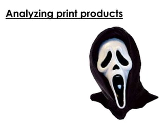
- 12. Scream 4 • Scream 4 featured on American magazine entertainment weekly's cover. It was a highly anticipated release as the scream films before it were incredibly successful and there has been a reasonable gap between their release and the latest installment. • The cover contains a red background fading into black with obvious connotations of danger, fear and death. • The films main antagonist is centered on the cover, taking up most of the space and the only sell lines are in the bottom right corner of the cover. • The magazine masthead in were it would usually be and that hasn’t changed for continuity reasons and the skyline along the top of the magazine is the same as it usually is, again for continuity so regular buyers of the magazine will see it straight away.
- 13. Main image… • The main image featured on the magazine is of Screams ongoing antagonist ‘Ghost face’. The antagonist in part of the Scream franchises iconography and is associated directly with the film, the antagonist is the same in all films, the disguise is just used by different people. The character is placed in the middle of the cover, looking directly at the viewer to catch their attention and probably scare them if they have seen any of the films. As soon as the viewer see’s the cover they will know straight away it is scream even if they haven't seen the film because people probably still know that the antagonist is featured in the films as it is so well known.
- 14. Sell lines… • The only sell lines on the cover are about the new Scream movie. • The main sell line states ‘Scream returns’ in big bold letters to catch everyones attention and then underneath that says the ‘bloody battle over scream 4’ which is a fitting way to talk about a horror film. • The next set of sell lines list the most famous stars that appear in the film and states that all of the stars look back of how the movies started, implying there are interviews with the stars within the magazine. • The sell lines are situated in the bottom right of the cover, leaving space for the main image to grab everyones attention, the sell lines are light brightly coloured which helps them stand out as they contrast well against the dark background and main image.
- 15. Blair witch project • This is an old Empire magazine cover featuring cult horror film ‘The Blair witch project’. • The colour scheme of the magazine is mainly red, white and black which are all colours often associated with the horror genre as both red and black have connotations of death and danger whereas white symbolizes innocence and vulnerability which is usually threatened in horror films. • The main sell line on the cover however, is in yellow, this will be to contrast against the other more severe colours used so the sell line stands out and catches the viewers attention. • Underneath the main sell line it says “keep telling yourself its only a movie” which implies that the movie is realistic in the horror it portrays and therefore more scary as audiences may be struggling to separate the film from reality. • The final sell line associated with the featured film states how much the film has freaked everyone else out and now its ‘here’, carrying on the horror, fans of the film and people who are anticipated to see the film will want to read the magazine to see what it has to say about the film. • The magazine also features an incentive to buy the magazine as it says it has ‘2000 free tickets’ to give away which will make people want to buy the magazine to be in with a chance of winning the
- 16. Main image… • The main image on the cover consists of some of the main characters from the film, the actors all have scared and shocked expressions on their face which are expressions you would expect of people in a horror film. • The actors are looking directly at the camera, which will catch the viewers attention and draw the viewer in as they will have direct eye contact with the actors on the cover. • The actors are placed around the main sell line, which is the films title, which is signifying that the film is centered around these characters and the ‘horror’ they are about to go through.
- 17. Masthead and skyline… • The magazines masthead is the same as it is on all covers, for continuity reasons, so that regular buyers of the magazine can see the magazine quickly and buy it and wont be wondering where it is if it looks different. • Underneath the films title it has the date and price of the magazine and also says “ The movie magazine” which states what the magazine is about. • The skyline at the top of the magazine doesn’t relate to the main image or sell lines but is instead about another film that was released at the same time that was also incredibly popular ‘American pie’ and the skyline says they have a photo special and also a feature on ‘Hollywood's sexy new stars’ which will make people want to buy the magazine, to see who these new stars are.
- 18. Sell lines and banner… • The cover also features other sell lines, not associated with the horror film on the cover but still linked as the other sell lines are all about other new releases. • The banner along the bottom of the cover states that every new film is been reviewed in the magazine, the banner then names some of the films featured inside the magazine, and the films listed on the cover are the films that the magazine company thinks will be the most popular film, that everyone will want to read about, and read Empires review on the film. There is also an image included on the banner of a screenshot from film ‘Deep blue sea’ which will give the viewer an insight as to what is featured inside the magazine. • The only other sell lines on the film, aren't associated with the horror film featured, as the magazine will be trying to appeal to a wide audience, not just people who enjoy horror films so the magazine has to make sure it has variety to not narrow down its target audience. • The other sell lines featured list various films and stars (‘De Niro, Clooney, Depp, Kidman, Diaz) which are all incredibly popular at the time to make people want to buy the magazine to see what the magazine has to say about the films and stars listed.
- 19. • Both of the magazines are similar in the way that they use similar colour schemes of red, white and black due to their connotations of danger and death, elements often association with the horror genre. • Both magazines have the same masthead and skylines are usual for continuity reason. • Both of the magazines main sell lines are associated with the featured film and main image, however on Entertainment Weekly magazine the only sell lines featured are about the new Scream film, where as Empire magazine has other sell lines that aren't abut The Blair witch project to keep its target audience open, as not everyone who buys the magazine may be a fan of horror films. • Both main images are of main characters from both films and both are looking directly at the camera and therefore directly at the viewer this is a good technique to use as it connects the viewer to the cover and catch the attention.