
Empfohlen
Weitere ähnliche Inhalte
Was ist angesagt?
Was ist angesagt? (20)
Andere mochten auch
Ähnlich wie Audience feedback to production
Ähnlich wie Audience feedback to production (20)
Kürzlich hochgeladen
Kürzlich hochgeladen (20)
Audience feedback to production
- 1. Audience Feedback to Production
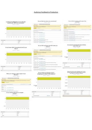
- 2. Audience Feedback on Production I produced a questionnairefor my magazine in order to see the target audiences views and opinions on it.I asked six people to fill in my questionnairewhich allowed me to find out what my target audience thinks about my pop magazineand to see what they think I could improveor change about it. All the answers where from females, this is whatmy magazine target audiencegender is however there is roomfor a maleaudience too, I used people of whom arewithin 15-19 years of age as this is whatmy target audienceis so the views will be accurateand I can take on board what they say and think about my magazine. From the results I received I found out that overall they believe my magazine will besuccessful and itappeals to them, I used vague broad questions alongsidestraightdirectquestions in order to get the best outcome possible,this also allowed me to get the best feedback as I had a mix of details.The firstmain question I asked was if they liked my colours in which they responded with yes and so I asked why in order for me to know if they relate to the audienceand intriguethem or if the colour scheme puts them off. The target audiencesaid that they did and it is conventional for the genre of pop and the colours relateto them as itis female-leaning however one person believed I should not have used black atall so this is somethingto consider.The audience thought it was eye-catching and typical. Followingon from colours I asked if they liked the fonts, in which they agreed and said they did enjoy the fonts used throughout my magazine. They believed that the fonts stand out as I have used both serif and sans serif and it follows the conventions and relates to the pop genre; they grab your attention, modern, happy vibe and looks fun and stylish. To link the fonts and colours together I asked if they liked the house style that I used in my magazineand if they found it conventional in which they responded with yes, 100% agreed. The idea of a house stylelikes is positivedueto it meant all my pages will link together and does not look likeseparate magazines or that it does not match nor contrastwith each page. I asked my target audience whether they liked my photos and images in my magazine, they all agreed that my images where effective sinceall theimages arein a variety of shot types, which allows thepage to be more visual,interestingand intriguing.They also said itcaptured the model well as she look attractiveand flawless in which they would liketo look like. They said they enjoy my photos and the model looks intriguingdueto the body languagebeing mysterious, the eye contact and the shot type varies,they also would liketo read more about the artistdue to the images used and would liketo look up to them positively.My models used are all conveyed in a fashionableand relatableway by all beingfemales and of a similar ageto the readers. I asked if the layoutwas conventional in order for my magazine to be successful and they all answered yes which allowed me to appeal more to the target audiences.I used the route of the eye and ruleof thirds to make itmore appealingand visual,italso allows thereader to get all the information needed quickly too and intriguethen. The ruleof thirds also allows thepage to not look cluttered but look mature and sophisticated. One important question I asked was the languageand mode of address,if they did not likethis than they would either find the magazine, to complex, or to childish; therefore not read my magazineso this needed to be good in order for my magazineto stand a chance. The languagehelps the target audience weather to buy it or not or if they can relate to itor not. Sincemy target audienceare older teenagers to young adults my languagewas enjoyed sincealthough was quite formal and used some intelligentwords it also used some Day- to-day talk and relates to them. The languageis not simpleand boringbut nor is itover the top and complex, it has elements of both formal and informal in order for them to relate to it. They all agreed that I used the right ratio of informal to formal elements in my magazine. The lastfew questions where quite simplebut justas significant.I asked about all the three pages, front cover, contents page and double page spread. They said thatthe front cover was intriguingand the double page spread was interesting and makes them want to the read the content inside.They also all thoughtthat my contents page was easy to navigatearound which is important. When I asked if there was anythingI could add or change to make it more effective they all said no but I could maybe add more jewlery for a younger target audiencehowever a younger audienceis not my target audienceso I will notincludethis is my ideas to
- 3. imporve. Overall I am happy with the feedback that I was given and my production went better than expected and eneded up lookinggood.