
Empfohlen
Empfohlen
Weitere ähnliche Inhalte
Kürzlich hochgeladen
Kürzlich hochgeladen (20)
Empfohlen
Empfohlen (20)
Design case study for a women focused Q/A forum
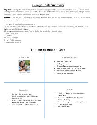
- 1. Design Task summary Objective: To design the home screen and the user onboarding process for an app platform where users (18-24 y.o. Indian women) can ask and answer questions about the things that matter in their lives. The primary product goal is to get users to login, ask/answer questions and come back to the app each day. Process: In this summary I have tried to explain my design process that I usually follow while designing UX/UI. I have briefly explained my design choice here. The standard procedure has following steps: 1.User Research for Identifying the target user of the intended app (Since we already know our target audience (18-24 y.o. Indian women, this step is skipped) 2.Personas and use case scenarios (how and when the user is likely to use the app) 3. Feature list for app 4. User flow 5.Quick wireframes 6. High Fidelity mockup 7. User testing (skipped) 1.PERSONAS AND USE CASES USER‐1: JIA (fictional user) Characteristics AGE: 18‐21 years old College Student Financially dependent on parents Interested in fashion and entertainment. Shares an apartment with friends. Cheerful and outgoing. Behavior Has a very short attention span. Identify online content related to fun and entertainment. Looks for easy & inexpensive life hacks to suit her lifestyle (as she is tight on money) Seeks answers for health and beauty tips. Needs Option for anonymity to hide identity on a public forum. Need answers for topics that she can’t discuss with family. Shorten learning curve by getting quick and reliable answers /tips. share experiences
- 2. USER NEEDS (combining needs of both user sets) 1. Get reliable content. 2. Quickly find useful content. 3. Satisfy curiosity 4. Option for anonymity 5. Necessary information should be available for skimming. OUR AIM 1.We need users to use our platform for asking questions and getting answers for topics that interest them the most. 2.We also want users to return back to our platform every day that means we need to generate curiosity among our users to use the app as a reliable and interesting guide for life problems. 3. We need to combine our objective with the user’s needs to generate a set of features of app. USER 2: ANJALI (fictional user) Characteristics AGE: 22‐24 years old Working professional Financially independent . Quite busy with work. Outgoing Health concious. Behavior Has less time to devote on online media Search for answers through online tools. Looks for recommendation regarding health, beauty, relationships. Identify and follow content for dedicated topics Typically uses media device after office and on weekends. Needs Option for anonymity to hide identity on a public forum. Need reliable and expert advice. Shorten learning curve by getting quick and reliable answers /tips. Share experiences and advice.
- 3. 2. FEATURE LIST FOR APP 1. Easy Login options. 2. Choosing and following interesting topics and question (for engaging user) 3. Create a newsfeed style homepage based on topics followed 4. Simple features such as like (heart symbol used in the mockup), comments. (typical forum features) 5. Ask, answer or reply as anonymous (to hide identity) 6. Follow people who write interesting answers. 7. Experts (such as doctors, psychologist, Popxo editors etc. )will get Popxo verified badges to distinguish them from others (this creates authority and reliability for readers) 8. Necessary information in a quickly glance able format. 9. Many people may have same question and everybody asking same question will lead to duplication of content. So to avoid it auto recommendation of question is needed for similar questions. 10. Since being a public forum with option to have anonymity, I can write gibberish answers to topics that I don’t have a clue of. This may lead to forum being unreliable and offsetting for users, so moderation of content from backend is required. This will also stop spamming of gibberish content. 11. Option for users to flag inappropriate content. 3. SIMPLIFIED USER FLOW
- 4. 4. WIREFRAMES Rough paper mockups of the app. Home screen (newsfeed) Select topic screen Login screen Ask Question screen Choose question to answer Write answer screen Detailed question screen Complete profile screen Notification screen
- 5. 5.HIGH FIDELITY MOCKUP A high fidelity mockup for home screen is shown below to demonstrate various design element of the app. There are 8 high fidelity mockup screen and a user flow within the mockups is included in the zip folder sent with this file. 6.DESIGN CUES Material Design Inspired Color scheme as per Popxo theme Rounded buttons for a soft feel (edgy design is often associated with masculinity) Minimalistic view for easy and distraction free reading Always on top bar for asking question, anytime the user want Write button for easy writing mode anytime. App is designed for easy skimming of content. Questions appear on the homepage from topics user have marked interest in. Always On ask question bar Hamburger menu for profile settings Home button for returning to homepage from anywhere Profile pic of answerer Follow an interesting question option Xo or love to show how many people liked your answer Answerer’s short Bio Question Answer summary To view detailed answer Write answer floating button Notification floating button Newsfeed