{Qatar{^🚀^(+971558539980**}})Abortion Pills for Sale in Dubai. .abu dhabi, sh...
Cover anaylisis
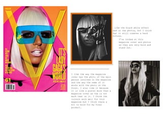
1. I like the black white effect
used on the photos, but I think
that it still creates a hard
picture.
I’ve looked at this
magazine cover and photos
as they are very bold and
stand out.
I like the way the magazine
cover has the photo of the main
person involved in the magazine
and the way the name of it
works with the photo on the
front. I also like it because
it is like a poster more than a
magazine cover as the is not
much text on it. I think the
colours work well for this
magazine but I think there a
bit to bold for my final
product.
2. Theses are more of
the colours I would
use in the magazine
as they are softer
and pretty there is
also the kind of
photos that I would
use for it.
3. I’ve looked
at the
photos of
artist from
the genre of
magazine I’m
doing I’ve
looked at
the photos
in the way
they are
taken and
costume and
also the
setting of
the photos.
This is not a music magazine but it the model
is the artist in the genre of the music
magazine I will be looking at. I’ve looked at
the colour shame which is what I will
probably use also the layout is very similar
4. I’ve looked at
the way the
photos have
been taken for
example the
angle,
lighting and
effects. Also
the costume
has a role too
in the photos
as it needs to
fit in with
theme and
genre of the
music.
This is a music magazine featuring Adele. The main focus is the picture
in the middle and then added text which creates depth and makes the
magazine look more interesting and makes you want to read it. I love
the main title this is an idea for the text I could use on my own music
magazine as it really captures your eye.