

Empfohlen
Weitere ähnliche Inhalte
Was ist angesagt?
Was ist angesagt? (20)
Ähnlich wie Digipak design
Ähnlich wie Digipak design (20)
Mehr von Alex Chenery-Howes
Mehr von Alex Chenery-Howes (18)
Kürzlich hochgeladen
Kürzlich hochgeladen (20)
Digipak design
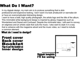
- 1. In my digipak design, my main aim is to produce something that is slick professional and expensive looking, I don’t want it to look amateurish or wannabe-ish or have an overcomplicated distracting design. I want to have a bold, high quality photograph, the artists logo and the title of the album. This minimalist white background design is inspired by glossy magazines such as Wonderland and Dazed and Confused. Despite the minimalist idea, I still want to convey an edginess and an artistic style that suits the music. I also want to style it in a way that is cohesive with the magazine advert and the music video, so I need to include a common element.
- 6. For me, I think that it is important that I research the style and look of my artist so I can make a consistent and cohesive style for my coursework. These are images of Dusepo’s artwork that I will make a moodboard of for inspiration, and to get an insight into his style.
- 7. Focus on close-up portraits Experimentation with photoshop Usage of blur and shadows to bring out the shades in the photo Consistent typography Edgy/Urban with some horror/sci fi influences Intense facial expressions
- 8. Simple backdrop, makes the person the main focus of the image. I find his quirky and unusual portraits of celebrities inspiring, it seems like he’s caught them off guard but still looks professional. I find his portrait of Mary Kate Olsen inspiring, seeing as she usually looks stylish and composed in fashion shoots I find her distressed and dishevelled look an interesting juxtaposition yet she still retains a striking look about her. When Terry Richardson photographs in black and white, I am appealed by the stark contrasts in light and dark, and how we are drawn to the portrait.
- 10. I definitely want to do a studio photoshoot, it looks simple yet very slick and professional. However, I am conflicted about whether to do a white or a black backdrop. I think that a certain edge will be retained by using a black backdrop, and a single white spotlight could really bring out the shades and tones in the photo and highlight the styling. Looking back at Dusepo’s artwork, I think that a black backdrop would be more suitable. But it may be more difficult to add detail such as titles. I want to have a cohesive style to the digipak, the magazine advertisment and the music video, so I want to have an alternative/edgy appeal. I think it may be interesting if I experiment with lighting and blur to make an abstract photo. Whilst reading Dazed and Confused I was drawn to this photoshoot of Daniel Radcliffe, it has an avant-garde appeal and is heavily stylised, despite being very multi coloured it has quite a dark use of shading